Many of my illustrations are about hot rods, flaming skulls, and the occasional pit bull. I make no apologies for that line of work. It pays well enough, it's in sufficient demand these days, and I enjoy the hell out of it.
But if I could truly make a go of a career that focused on illustration in a surreal style, I would. I'll always draw hot rods, but there's a constantly squirming lobe of my brain that would love to paint mysterious, dreamlike scenes with the fluidity of Michael Parkes and the intrigue of Eric White. So to keep the squirming brain in check, I occasionally clear some time on my calendar and some space on my drawing table for an intuitive, concept-driven piece. Recently, I made The Fish during just such a pursuit:

The print measures 12" x 22" and was painted entirely in PhotoShop using my new Wacom Intinuous3 tablet. Getting the right look for the water reflections took quite a bit of research and tweaking.
This post is not a tutorial, but more of a discussion about my process. If you're interested how I made this painting, read on...
The Concept
The concept about this image came primarily from a dream. I often dream about fish, especially colorful fish. They're usually huge, they're always friendly, and sometimes they talk. (I realize that the needle on my freak-o-meter is pushing well into the red zone, but if you haven't figured that out by now, you're either a new reader or not a keen judge of character.)
As an aside, the fish in the dream that inspired this illustration didn't talk to me, but it did live a brief period of time as an unconscious nude woman sleeping in a partially submerged shipwreck. All you arm-chair psychologists out there, have a ball.
Sketching and Layout
Like every project, I start with a freehand sketch that's nearly the size of the final print. I don't usually do thumbnail sketches when the layout is clear in my mind. For self-promotion work, that's nearly always the case.
The patterns on the fish are loosely based on a parrot fish. Very loosely.

After scanning in the sketch, I could see that the boat looked too elongated to me, and the fish needed more, I dunno, wiggle. Scanning changes your working medium from paper to monitor, and much like flipping an image left-to-right and back again, the shift in visual input changes your read on an image and makes proportion problems or scale inaccuracies stand out like a drunken banjo player at a Finnish funeral.
To fix these problems, I just used Edit-->Transform-->Warp on both elements to get the right POV for the boat and to put more of a sense of motion to the fish.


At this point, it's clear that the image is lacking a dude. The scale of the original sketch was too small for me to draw a well-proportioned human figure, so on a separate sheet, I sketched the following figure at about twice the scale of the final image.
(You can still see the faint lines indicating legs and feet on the lower right. I drew those in, then erased them immediately after recognizing that they made the image look too much like the figure in Andrew Wyeth's Christina's World.)

I scanned in the figure and placed the image onto the original sketch, scaling and distorting along the way until it seemed to fit into the boat nicely.


Painting the Sky and Water
I placed the two sketch layers into a group called Background, and made two additional groups, one called Sky and the the other Water. In the Sky group, I started a new layer and began painting big ol' fat strokes of primary colors like blue, cyan and magenta using a watercolor brush from Bittbox set at about 50% opacity. I overlapped each color and left about 1/4 of the sky nearest the horizon white. Then I whacked away at whole sky with the Spot Healing Brush to give it the look of a watery wash. In my hands, the Healing Brush is fairly unpredictable, so I sometimes have to smooth out the resulting splotchy areas with the Smudge Tool.
When the colors all blend evenly - but not too evenly - I adjusted the final color balance using Hue/Saturation/Brightness until the it looked like this:

Next, I zoomed up on the upper left-hand corner and made a moon by selecting a circular region and filling it with a white-to-transparent linear gradient set at an overall transparency of about 70%. A couple of dabs with a soft, transparent Eraser Tool later, and we got ourselves a pretty realistic looking moon.

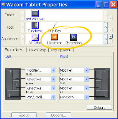
Using a small round brush, I painted a gray and white jet liner and two long, soft lines for the condensation trail. (The shift key is the best way to snap a straight line across a canvas, but you have to be sure to turn off the brush's Shape Dynamics if you're using a pen tablet.)

Now with the sky completed, I made the far-field reflection of the sky around the horizon by simply copying the Sky layer into the Water layer group and flipping it vertically using Edit-->Transform-->Flip Vertical.

I wanted to paint some little puffy clouds that were reflected in the water, so to keep from going completely nuts, I rotated the canvas 180 degrees so I could paint the rest of the sky reflections as if I were just painting sky, right-side up. On a separate layer, I used a soft round brush with white for the highlights and darker, desaturated samples of the sky color for the shadowy areas. I also painted a few quick horizontal strokes across the water to begin showing waves.

Then, with canvass flipped back upright, I put a gradient layer mask on the water layer below the cloud reflection layer, and put a solid layer of deep green below them. The fish will eventually be swimming up from these green depths so I wanted the viewer to feel like they can see deep in to the water, but I still wanted the cloud reflections to give a sense of surface.

Next, I zoomed up on the boat and used a watercolor brush set to Multiply to paint the deep shadow reflections.


Painting the Boat and Dude
Using the pen tool, I outlined portions of the boat sketch where I knew I wanted crisp edges. In the screen-shot below, you can see where I drew a path outlining the bow, stern, and gunwales. Right-clicking on the path and choosing "Make Selection" turns the path into a selection and allows you to paint inside the lines. My elementary art teacher would be proud.


My dude had some pretty boring hair in the sketch, so I thought I'd give him a little more been-lost-at-sea-for-weeks look. Shadows on the boat floor were painted using paths as selections and infilling with a blue-gray color set to Multiply.

Painting the Fish
I saved this for last. It was the cherry at the bottom of my Manhattan.
After turning off all the layers, and moving the Background layer to the top of the stack and setting its blend mode to Multiply, I used the pen tool to draw a path that followed the shape of the fish. I then made a selection from the path.


The parrot fish was my inspiration, but only for coloring and patterns. Besides, I wanted my creature to be friggin' huge, and I think parrot fish are only a few pounds at most. Just like I did with the sky, I painted the three basic colors using a broad brush then blending them together using the Healing Brush. Then, using a small round brush, I added the patterns and details.


To get the effect of the fish rising up from the green depths, I put the fish layers above deep green solid layer and set their layer mode to Color Burn. A layer mask on the fish layer makes the tail fade into the distance.

The fish really looks like it's swimming up from below the surface now. But the water is way too calm.

Watery Ripply Wavey Effects
This is where some research and experimentation came in. I found this tuturial on-line, and I could barely believe my eyes. It describes how to generate your own displacement filter map using the red and blue channels of an image that you generate purely from noise. It even allows you to embed the perspective distortions you need to make the waves recede into the distance.
It took me at least three tries to get the map to work right. Suffice to say, if you try this method, be sure to follow each and every instruction in the tutorial. Leaving out even one step or fudging even one input will give you disappointing results.
What the writer of the tutorial doesn't tell you is that when you apply the displacement map using Filter-->Distort-->Displace, you'll need to experiment with the scale factors, starting somewhere in the 500 range for horizontal scale, and 200-300 for vertical. I spent hours fiddling around with sub-100 scale factors and mistakenly deducing that the process was worthless. Once I bumped up the scale enough, the effects became noticeable.
It took me awhile to realize that the displacement map method simply shifts existing pixels left and right, and up and down, according to a wavey-looking noise pattern defined in a separate .psd file. So it won't, for example, make a wavey, watery surface appear on a solid field of color. It needs surface reflections to act on. I learned through experimentation that the clouds and other reflections I painted weren't going to be enough.
Using a light cyan foreground and whitish background, I used PhotoShop's cloud generater under Filter-->Render-->Clouds. I know that sounds like cheating, but the end result is completely unrecognizable from those fake clouds. Besides, after admitting that I dream about talking fish, I figure that this is no biggie.
After generating the clouds, I applied two maximum instances of perspective transformations to the clouds, then added a significant amount of horizontal motion blur using Filter-->Blur-->Motion Blur set at 90 degrees and a distance of about 30. Then with the layer's trasparency at 100%, I applied the displacement map according to the tutorial's instructions and using the scale factors I figured out from earlier experimentation. (I suggest doing all this experimentation in a separate file because the computation times can get pretty long.) Here's how that looked:

I copied and pasted this layer below my painted cloud reflections and above the fish, lowered the transparency, and gave it a Linear Burn blending mode.
Here's the final image:
I suppose if I were truly going to paint in the surrealist style, I'd have added a sleeping nude woman floating below the fish and posed mid-morph on her way to full fishdom.
Alas, Dali I ain't.
Now back to the drawing board.
Read the full post...
 A couple months ago, I received a call from Steve "Carpy" Carpenter. If you love motorcycles and know anything about café racing, you know who Carpy is. My problem was, when he called, I didn't—and he knew it.
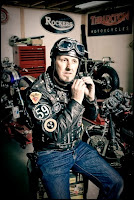 Steve Carpenter


