This was my first experience with digital printing on a large vinyl banner. Somehow, technology sneaked past me during one of my many coffee breaks and delivered full-color digital printing on vinyl banners.
Didn't see that one coming.
But now it's everywhere, and just about every print shop around will print up a photo-quality image big enough to cover your house, should such a need arise.
Fortunately, my client was in need only of a 2ft x 4ft banner for her booth at an upcoming landscape design convention.
That's all I had to say. Thanks for checking though.
Wednesday, December 31, 2008
Digital Banner Printing
Wednesday, December 17, 2008
Process Notes on The Fish
Many of my illustrations are about hot rods, flaming skulls, and the occasional pit bull. I make no apologies for that line of work. It pays well enough, it's in sufficient demand these days, and I enjoy the hell out of it.
But if I could truly make a go of a career that focused on illustration in a surreal style, I would. I'll always draw hot rods, but there's a constantly squirming lobe of my brain that would love to paint mysterious, dreamlike scenes with the fluidity of Michael Parkes and the intrigue of Eric White. So to keep the squirming brain in check, I occasionally clear some time on my calendar and some space on my drawing table for an intuitive, concept-driven piece. Recently, I made The Fish during just such a pursuit:
The print measures 12" x 22" and was painted entirely in PhotoShop using my new Wacom Intinuous3 tablet. Getting the right look for the water reflections took quite a bit of research and tweaking.
This post is not a tutorial, but more of a discussion about my process. If you're interested how I made this painting, read on...
The Concept
The concept about this image came primarily from a dream. I often dream about fish, especially colorful fish. They're usually huge, they're always friendly, and sometimes they talk. (I realize that the needle on my freak-o-meter is pushing well into the red zone, but if you haven't figured that out by now, you're either a new reader or not a keen judge of character.)
As an aside, the fish in the dream that inspired this illustration didn't talk to me, but it did live a brief period of time as an unconscious nude woman sleeping in a partially submerged shipwreck. All you arm-chair psychologists out there, have a ball.
Sketching and Layout
Like every project, I start with a freehand sketch that's nearly the size of the final print. I don't usually do thumbnail sketches when the layout is clear in my mind. For self-promotion work, that's nearly always the case.
The patterns on the fish are loosely based on a parrot fish. Very loosely.
After scanning in the sketch, I could see that the boat looked too elongated to me, and the fish needed more, I dunno, wiggle. Scanning changes your working medium from paper to monitor, and much like flipping an image left-to-right and back again, the shift in visual input changes your read on an image and makes proportion problems or scale inaccuracies stand out like a drunken banjo player at a Finnish funeral.
To fix these problems, I just used Edit-->Transform-->Warp on both elements to get the right POV for the boat and to put more of a sense of motion to the fish.

At this point, it's clear that the image is lacking a dude. The scale of the original sketch was too small for me to draw a well-proportioned human figure, so on a separate sheet, I sketched the following figure at about twice the scale of the final image.
(You can still see the faint lines indicating legs and feet on the lower right. I drew those in, then erased them immediately after recognizing that they made the image look too much like the figure in Andrew Wyeth's Christina's World.)
I scanned in the figure and placed the image onto the original sketch, scaling and distorting along the way until it seemed to fit into the boat nicely.

Painting the Sky and Water
I placed the two sketch layers into a group called Background, and made two additional groups, one called Sky and the the other Water. In the Sky group, I started a new layer and began painting big ol' fat strokes of primary colors like blue, cyan and magenta using a watercolor brush from Bittbox set at about 50% opacity. I overlapped each color and left about 1/4 of the sky nearest the horizon white. Then I whacked away at whole sky with the Spot Healing Brush to give it the look of a watery wash. In my hands, the Healing Brush is fairly unpredictable, so I sometimes have to smooth out the resulting splotchy areas with the Smudge Tool.
When the colors all blend evenly - but not too evenly - I adjusted the final color balance using Hue/Saturation/Brightness until the it looked like this:
Next, I zoomed up on the upper left-hand corner and made a moon by selecting a circular region and filling it with a white-to-transparent linear gradient set at an overall transparency of about 70%. A couple of dabs with a soft, transparent Eraser Tool later, and we got ourselves a pretty realistic looking moon.
Using a small round brush, I painted a gray and white jet liner and two long, soft lines for the condensation trail. (The shift key is the best way to snap a straight line across a canvas, but you have to be sure to turn off the brush's Shape Dynamics if you're using a pen tablet.)
Now with the sky completed, I made the far-field reflection of the sky around the horizon by simply copying the Sky layer into the Water layer group and flipping it vertically using Edit-->Transform-->Flip Vertical.
I wanted to paint some little puffy clouds that were reflected in the water, so to keep from going completely nuts, I rotated the canvas 180 degrees so I could paint the rest of the sky reflections as if I were just painting sky, right-side up. On a separate layer, I used a soft round brush with white for the highlights and darker, desaturated samples of the sky color for the shadowy areas. I also painted a few quick horizontal strokes across the water to begin showing waves.
Then, with canvass flipped back upright, I put a gradient layer mask on the water layer below the cloud reflection layer, and put a solid layer of deep green below them. The fish will eventually be swimming up from these green depths so I wanted the viewer to feel like they can see deep in to the water, but I still wanted the cloud reflections to give a sense of surface.
Next, I zoomed up on the boat and used a watercolor brush set to Multiply to paint the deep shadow reflections.

Painting the Boat and Dude
Using the pen tool, I outlined portions of the boat sketch where I knew I wanted crisp edges. In the screen-shot below, you can see where I drew a path outlining the bow, stern, and gunwales. Right-clicking on the path and choosing "Make Selection" turns the path into a selection and allows you to paint inside the lines. My elementary art teacher would be proud.

My dude had some pretty boring hair in the sketch, so I thought I'd give him a little more been-lost-at-sea-for-weeks look. Shadows on the boat floor were painted using paths as selections and infilling with a blue-gray color set to Multiply.
Painting the Fish
I saved this for last. It was the cherry at the bottom of my Manhattan.
After turning off all the layers, and moving the Background layer to the top of the stack and setting its blend mode to Multiply, I used the pen tool to draw a path that followed the shape of the fish. I then made a selection from the path.

The parrot fish was my inspiration, but only for coloring and patterns. Besides, I wanted my creature to be friggin' huge, and I think parrot fish are only a few pounds at most. Just like I did with the sky, I painted the three basic colors using a broad brush then blending them together using the Healing Brush. Then, using a small round brush, I added the patterns and details.


To get the effect of the fish rising up from the green depths, I put the fish layers above deep green solid layer and set their layer mode to Color Burn. A layer mask on the fish layer makes the tail fade into the distance.
The fish really looks like it's swimming up from below the surface now. But the water is way too calm.
Watery Ripply Wavey Effects
This is where some research and experimentation came in. I found this tuturial on-line, and I could barely believe my eyes. It describes how to generate your own displacement filter map using the red and blue channels of an image that you generate purely from noise. It even allows you to embed the perspective distortions you need to make the waves recede into the distance.
It took me at least three tries to get the map to work right. Suffice to say, if you try this method, be sure to follow each and every instruction in the tutorial. Leaving out even one step or fudging even one input will give you disappointing results.
What the writer of the tutorial doesn't tell you is that when you apply the displacement map using Filter-->Distort-->Displace, you'll need to experiment with the scale factors, starting somewhere in the 500 range for horizontal scale, and 200-300 for vertical. I spent hours fiddling around with sub-100 scale factors and mistakenly deducing that the process was worthless. Once I bumped up the scale enough, the effects became noticeable.
It took me awhile to realize that the displacement map method simply shifts existing pixels left and right, and up and down, according to a wavey-looking noise pattern defined in a separate .psd file. So it won't, for example, make a wavey, watery surface appear on a solid field of color. It needs surface reflections to act on. I learned through experimentation that the clouds and other reflections I painted weren't going to be enough.
Using a light cyan foreground and whitish background, I used PhotoShop's cloud generater under Filter-->Render-->Clouds. I know that sounds like cheating, but the end result is completely unrecognizable from those fake clouds. Besides, after admitting that I dream about talking fish, I figure that this is no biggie.
After generating the clouds, I applied two maximum instances of perspective transformations to the clouds, then added a significant amount of horizontal motion blur using Filter-->Blur-->Motion Blur set at 90 degrees and a distance of about 30. Then with the layer's trasparency at 100%, I applied the displacement map according to the tutorial's instructions and using the scale factors I figured out from earlier experimentation. (I suggest doing all this experimentation in a separate file because the computation times can get pretty long.) Here's how that looked:
I copied and pasted this layer below my painted cloud reflections and above the fish, lowered the transparency, and gave it a Linear Burn blending mode.
Here's the final image:
I suppose if I were truly going to paint in the surrealist style, I'd have added a sleeping nude woman floating below the fish and posed mid-morph on her way to full fishdom.
Alas, Dali I ain't.
Now back to the drawing board.
Wednesday, December 10, 2008
A Christmas Story on Stage

Everybody loves Ralphy, Randy, The Old Man, pink bunny slippers, and of course the official 200-shot Red Ryder air rifle. Author, radio personality, and master of comedic hyperbole ("...Scut Farkus staring out at us with his yellow eyes. He had yellow eyes! SO HELP ME GOD, YELLOW EYES!!") Jean Shepherd co-wrote the movie A Christmas Story in 1983 based on his short stories, some of which were based on his true life experiences, some on fiction. To be honest, no one but Mr. Shepherd knew how much of the former was mixed with the latter.
Read on...
Topeka, KS playwright Phil Grecian adapted the movie to the stage in 2000. Eight years later, the script found its way to Lawrence, KS. Director Charles Goolsby ably assisted by stage manager Lydia Shontz (my adorable and talented daughter) coralled a cast of more than a dozen child actors and nearly as many adults onto the stage of the Lawrence Community Theatre for what will total eleven hilarious shows this holiday season. I designed the promotional poster for this production in exchange for four tickets to the December 4th show.
Aside from the professional production value - including detailed sets, period-appropriate costumes, and spot-on dialogue - the complexity of the production combined with the daunting task of keeping a gaggle of children as young as nine on task for weeks of rehearsals and performances was awe inspiring.
I was a bit concerned that the charm of the movie would be lost in translation to the stage, but that just didn't happen. I enjoyed the play every bit as much as the movie, and in some ways even more. Somehow, Grecian managed to work every memorable scene from the movie into the script. And director Goolsby blocked the actor's positions so well that no one in the audience missed any of the comedy - even on the tiny thrust stage with seating on three sides.
What I love most about live theater is its three-dimensional quality; the ability to move around the set in your mind while directing your attention to any actor without regard to whether they are important to the scene at any given moment is impossible with two-dimensional media like TVs or projection screens. (Don't worry, I won't launch into why I hate TV; you can read about that here if you want to know.)
Beside the quality of the performances, I love that my daughter had such an important role in putting the production together. She has always been a theater kid, both on-stage and off. Now she's a theater woman (well, young woman - let's not get ahead of ourselves here), and I couldn't be prouder.
She also got me the design gig, so I got that going for me. Which is nice.
Now back to the drawing board.
Saturday, December 6, 2008
Game Dog Guardian Logo
After months of drawing and tweaking, and six trash-cans-full of wadded-up trace paper later, here's the logo that Killer Kite and I came up with for a new pit bull rescue operation.
Saturday, November 29, 2008
Take the Go Green Score challenge.
Sunday, November 23, 2008
Fast Times at El Camino High
I received a call from Scott Rehn, the Announcer and Event Promoter from Championship Offroad Racing. He's working with El Camino High School in Oceanside, CA, one of two schools selected to be featured in an upcoming episode of Drag Race High on the Speed Channel. It's a reality show, and camera crews record students in auto shop class as each school builds a high performance drag racer from an old muscle car. When the cars are finished, professional NHRA drivers race them down the quarter mile for bragging rights on the national stage.
Scott contacted me because he found this illustration of a 1967 Chevelle SS 396 on my portfolio website.
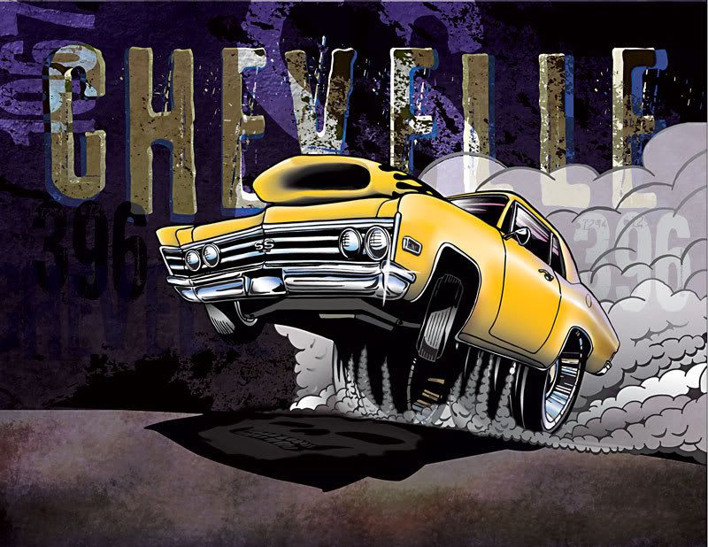
As luck would have it, El Camino High's car is based off a 1970 Chevelle SS. Scott liked the style of the illustration and asked if I could make a few changes to customize it for the school and the show. Read on...
Though Chevelle enthusiasts may disagree with me, the body styles don't differ much between the '67 and '70 model years, especially when rendered in semi-cartoon style. I did have to change the grille from the older four-headlamp setup to the twin headlamp grille that came later. Also, I changed the orientation of the shaker hood to match the one on El Camino's car. Then we added the school's name in the background and squeezed the giant head of a cougar - the school's mascot - into the driver's side window, sort of Big Daddy Roth style. We also threw in a few other goodies designed to poke fun at their rival school.
Here's what we came up with:
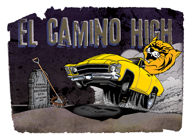
The torn edges came from a page of a very old book that good old Bittbox scanned in and offered up for free on his web site. I converted the scan to greyscale, maxed out the contrast, and used the image as a layer mask. Bada bing, bada boom.
With any luck, some of the kids will be wearing this emblem on their shirts while the crews are filming. What a hoot.
Now back to the drawing board.
Scott contacted me because he found this illustration of a 1967 Chevelle SS 396 on my portfolio website.
As luck would have it, El Camino High's car is based off a 1970 Chevelle SS. Scott liked the style of the illustration and asked if I could make a few changes to customize it for the school and the show. Read on...
Though Chevelle enthusiasts may disagree with me, the body styles don't differ much between the '67 and '70 model years, especially when rendered in semi-cartoon style. I did have to change the grille from the older four-headlamp setup to the twin headlamp grille that came later. Also, I changed the orientation of the shaker hood to match the one on El Camino's car. Then we added the school's name in the background and squeezed the giant head of a cougar - the school's mascot - into the driver's side window, sort of Big Daddy Roth style. We also threw in a few other goodies designed to poke fun at their rival school.
Here's what we came up with:
The torn edges came from a page of a very old book that good old Bittbox scanned in and offered up for free on his web site. I converted the scan to greyscale, maxed out the contrast, and used the image as a layer mask. Bada bing, bada boom.
With any luck, some of the kids will be wearing this emblem on their shirts while the crews are filming. What a hoot.
Now back to the drawing board.
Monday, November 17, 2008
Wacom Rules the Planet. Resistance is Futile.
There's no doubt about it now, my Wacom pen tablet iz tha shiz, y'all. It has sped up my workflow, improved the quality of my line work, expanded my digital painting capabilities, and on more than one occasion made me giggle like a little girl just from the sheer joy of drawing.
Yes, a little girl. I'm secure, I can say it.
Here's the first work I made using this patently perfect peripheral:
If you're considering the purchase of a Wacom tablet, read on...
First, the 6x8 model is the perfect size for the work I do. If you tend to use your elbow as a pivot point when striking a long smooth arc, the next smaller version, the 4x6 model, couldn't possibly be give you enough real estate to pull it off. And the next larger sizes, the 6x11 and the 9x12, seem too bulky to hold comfortably in your lap. Unless you have a lap the size of an Astro Van. Besides, Danidraws.com recommends the 6x8, and that's good enough for me.
The tablet has a total of eight buttons. They're grouped in two clusters of four, one cluster in each upper corner. Of course, they're fully programmable. And, you can specify different functions for each button depending on what application you're running. For example, a button can execute the "b" shortcut (the Brush tool) when you're in Photoshop, and the same button can activate the "p" shortcut (the Pen tool) when you're in Illustrator.
I don't know about you, but that makes me all tingly.
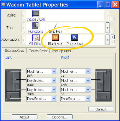
In the left group, I programmed the upper-right button for the "e" shortcut (Eraser tool), and the button below it for the "b" shortcut. That way, I can toggle between the two functions with my left hand while my right hand is busy layin' down the love. (Wait, that didn't sound right, did it?)
Next to each group of buttons is a touch-strip that is also programmable, but is useful only for zooming and scrolling. If you've used a touch pad on a lap-top computer, you'll no doubt have no trouble getting used to the touch-strip.
Finally, Wacom's website also has a great list of tips and tricks for Photoshop, Corel Painter, and Adobe Flash. These guys know how to do support right.
Yes, I'm glowing. This thing is fan-frickin-tabulous.
I'm not ashamed of my feelings.
Now back to the drawing table(t).
Yes, a little girl. I'm secure, I can say it.
Here's the first work I made using this patently perfect peripheral:
If you're considering the purchase of a Wacom tablet, read on...
First, the 6x8 model is the perfect size for the work I do. If you tend to use your elbow as a pivot point when striking a long smooth arc, the next smaller version, the 4x6 model, couldn't possibly be give you enough real estate to pull it off. And the next larger sizes, the 6x11 and the 9x12, seem too bulky to hold comfortably in your lap. Unless you have a lap the size of an Astro Van. Besides, Danidraws.com recommends the 6x8, and that's good enough for me.
The tablet has a total of eight buttons. They're grouped in two clusters of four, one cluster in each upper corner. Of course, they're fully programmable. And, you can specify different functions for each button depending on what application you're running. For example, a button can execute the "b" shortcut (the Brush tool) when you're in Photoshop, and the same button can activate the "p" shortcut (the Pen tool) when you're in Illustrator.
I don't know about you, but that makes me all tingly.
In the left group, I programmed the upper-right button for the "e" shortcut (Eraser tool), and the button below it for the "b" shortcut. That way, I can toggle between the two functions with my left hand while my right hand is busy layin' down the love. (Wait, that didn't sound right, did it?)
Next to each group of buttons is a touch-strip that is also programmable, but is useful only for zooming and scrolling. If you've used a touch pad on a lap-top computer, you'll no doubt have no trouble getting used to the touch-strip.
Finally, Wacom's website also has a great list of tips and tricks for Photoshop, Corel Painter, and Adobe Flash. These guys know how to do support right.
Yes, I'm glowing. This thing is fan-frickin-tabulous.
I'm not ashamed of my feelings.
Now back to the drawing table(t).
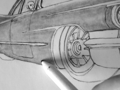
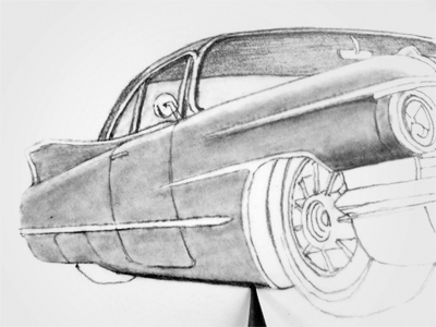
A 1957 Chevy Bel Air and a Better Mouse Trap
I thought I'd have some fun with a 1950's Texaco ad I found on-line while perusing vintage ads for a themed restaurant in North Kansas City.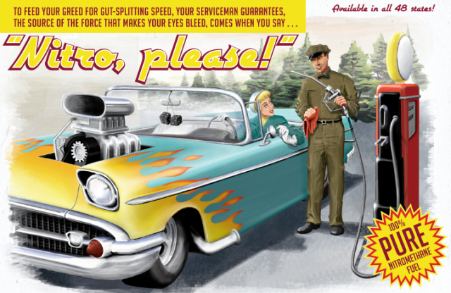
The poster is 22" x 14" and was painted digitally in Photoshop using brushes I downloaded free from Bittbox.
The entire painting was done using a mouse, which is a process akin to threading a needle with Novocain shots in each finger and wearing boxing gloves. While blindfolded. And drunk.
Things are looking up for the badger, though. I've done my part to help the global economy by making a very wise purchase.
Read on...
I just purchased a Wacom Intuos3 6x8 pen tablet for just a smidgen under $300.00. I plan on writing more about it once the two of us have had more quality time together.
But in the meantime, here are a couple of things I've noticed:
1) Wacom's customer service is stellar. The tablet had a few performance glitches pretty early on, well before I'd finished pinching all the bubble wrap. I was ready to just pack the thing up and send it back - y'know, with the bubble wrap still intact and all, it seemed the easiest solution. Besides, ever since my Microtek scanning software refused to recognize its own scanner and I had a stunningly abysmal experience with Microtek's laughable technical service, I acquired a profanity-laced Tourettes-like tic at the mere thought of contacting any computer peripheral company with questions of any kind. But Wacom suprised me. I emailed their customer support with a description of the problem, and within a day, a friendly gentleman replied with detailed troubleshooting instructions. And when that fix turned out to be only partially effective, a simple email back to customer service brought another helpful reply within 24 hours. I'm still working through the problems (the pressure sensitivity in brush-mode cuts in and out), but I'm pleased that so far, Wacom has made good on their promise to provide prompt technical support.
2) There's a little button in the Wacom control panel called "Lock Proportions." It's located in the Mapping Tab of the tablet setup. Click it on if you want to remain sane. I'm just sayin'. If it's off (which unfortunately is the default setting) the tablet maps its entire surface to your monitor screen. That sounds fine in theory, but if the tablet and screen are not the same proportion, then you'll see an ellipse whenever you try to draw a circle. Talk about a brain-boink. Sure you may lose a bit of usable tablet space, but unless you feel like retraining your visual cortex, I suggest you turn it on.
3) The tablet's drawing surface and the heal of my hand have a relationship to each other similar to Naugahyde against a sweaty butt-cheek. As a result, I tend to get jumpy lines as I drag my hand across the tablet and it sticks. I'm going to try cutting the fingertips off of a cotton glove and wearing it on my drawing hand, Michael Jackson style, so my hand can slide easily across the tablet. I'll let you know if that works.
4) I reprogrammed the front rocker switch on the pen to act as {alt}-{ctrl}-z, which in Photoshop means "Step Backwards" through the undo history. This is slick because my first attempt at drawing a line is seldom my best one. Somewhere around attempt number eight or nine, I either get the line I want or I simply lower my standards a sufficient level to call it good. With this switch setup, marching through each attempt is as easy as draw, click, draw, click...all with one hand.
I'm working on an "ink" drawing with the pen tablet now. Should be done in a week or so, and I'll post the results here. So far, the tablet experience is so superior, it makes using a mouse feel like trying to draw with a crayon taped to your elbow.
Now back to the drawing board.
Friday, October 3, 2008
Age 26
I found this self-portrait (or "elf-portrait") in a box of old photos. I think I was about 26 at the time, working as an engineer for GM and about ready to be a father.
Yes, this freak was fruitful and multiplied.
Yes, this freak was fruitful and multiplied.
Tuesday, September 30, 2008
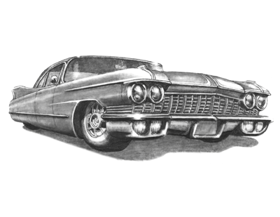
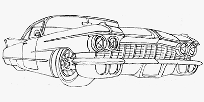
Don't Fight the Graphite
Pencils don't get the respect they deserve. What with the popularity of digital image processing, vectorized line work, and - what's that stuff called? - oh yeah, paint. Sadly, it seems the pencil has been forgotten at the bottom of everyone's Art Bin along with the Pop Tart crumbs and that rock-hard tube of Liquitex Medium Magenta.
But I ask you, who doesn't love the feel of a bright yellow Ticonderoga #2 wood pencil twirling in your fingers or tapping on the edge of your desk? Nobody, that's who.
Read on...
I say the wood pencil deserves to return to its iconic stature, with the makin'-it-happen end sharpened to a long, acicular point, and the pretend-it-didn't-happen end gnawed into an unrecognizable wad of crushed metal and moist rubber. Stick it behind your ear. Chew the paint off it. Hold it flat in your hand, thrust your arm upward, slap your wrist with the other hand, and watch your beloved writing implement rocket skyward until the point embeds itself in your office ceiling. Despite written claims to the contrary, Heaven is a place stocked with an endless supply of sharp wood pencils and thousands of square miles of acoustic ceiling tile.
The pencil is a nearly perfect writing instrument. It's also a darn good drawing tool, as any bored art-kid stuck in High School history class will tell you. It can track a thin line that's so faint, you'll swear one of your arm-hairs fell onto the page. With a firm overhand grip, that same pencil can lay down a heavy pool of slick, black powder that, despite your best efforts, will end up partially smudged on your cheek. And with a skilled hand, it will create smooth, luxurious washes of silvery grey in any shade imaginable.
I've always been comfortable drawing with pencils. I've loved them all my life. Hell, I'm 46 years old and I still have a visible piece of pencil lead imbedded under the skin of my right palm from a John Bonham style drumming mishap in the third grade.
Today I use a Ticonderoga No.2 wood pencil for nearly all my pencil-roughs, layouts, contour drawings, and sketches.
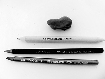
They can be sharpened in any standard pencil sharpener, though I've been told that the preferred method is using a sheet of fine-abrasive sandpaper. They're available in several hardnesses, though typically a 6B will do most everything that I need for shaded sketching.
In pencil parlance, the hardness of the lead is graded by varying levels of "H" for "hard" and "B" for "black" (*). HB stands for "Hard Black" (**) and is equivalent to the classic No. 2 pencil. Softer - and therefore darker rendering - pencils are labeled with increasing values of "B." A 6B lead is much softer than an HB, and 9B is softer still. I find that 6B is amazingly versatile for shaded renderings, able to hold a decent point while still laying down a pretty funky bass-note when asked. I suppose having a super soft 9B on hand would be helpful for deep black areas, but I haven't yet found much need for one yet. Harder pencils can range up to 6H, even harder. A 6H pencil makes a very thin, very light line, and is more comfortable in the hands of a draftsman than a sketch artist. It also doubles as an Exact-o knife.
Now, you'll notice that the art pencils don't have erasers attached to them. That's because artist's are nervous critters by nature, and we'd chew them off before we finished our first layout. So, we buy separate erasers, either of the soft block or kneaded variety. Be warned: these are not interchangeable! The block style, usually made from firm chunks of vinyl, erases using an abrasive action. It literally grinds out the graphite particles from the tooth of your paper. It's useful for removing large areas of goof-ups on bond papers, sketch pads, and Bristol board because these papers absorb (sort of) the graphite dust and need a rather aggressive approach to clean-up. Kind of like my 14-year-old stepson.
Kneaded erasers are more like Silly Putty; they are sticky, and they work by lifting graphite right off the paper. You don't usually rub a kneaded eraser across your work, you dab it right onto the area you want removed. Because they're kind of gooey, you can even mold kneaded erasers into pointed shapes to pick off tiny spots without disturbing the surrounding work.
I also use a mechanical pencil. Specifically, I use a Koh-I-Noor 0.7mm drafting pencil loaded with F lead. F is approximately halfway along the pencil hardness scale between HB and H, and I suppose it would be similar to the No. 3 lead in a classic wood pencil, though I can't prove this. I don't know what the F stands for, but let's call it "Fine." The F hardness in a 0.7 mm pencil is very useful for fine detail work, thin contour lines, or anytime I need to draw a hard edge along a metal, cork-back ruler.
Mechanical pencils like the Koh-I-Noor are also available in an absurdly thin 0.3mm variety, and I own one. I just never use it. I do sometimes use the uber-fat 0.9mm version for heavier line work. That bad boy gets H ("Heavy," slightly harder then HB) lead.
One other snazzy gizmo I use often is the eraser shield. It's basically a stainless-steel stencil that masks the work you want to keep while exposing tiny lines, dots, or arcs that you want to attack with your eraser.
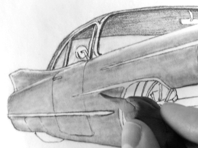
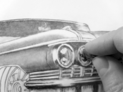
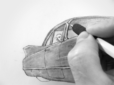
Oddly, the majority of the real estate in my graphite drawings is produced using a blending stick, not a pencil. These tightly rolled sticks of paper push the graphite dust around the surface of your page to create those smooth gradients of gray.
After the base layer of gray is down, I can start adding shade and shadow. Again, I lay down a heapin' helpin' of graphite in the darkest areas, then feather it out into the lighter areas using the blending stick. Here, the quarter panel area behind the headlight has been blended out while I'm starting to shade the rocker panel.
The key is to start light, then build to dark. It's tempting to fill in all the heavy shadow areas early so that the image will pop. But you must resist. The danger is that you'll smear all that graphite dust over your drawing as you work on the finer details. Details first, shadows last. Also, never let your bare skin touch the artwork; always rest your hand on a clean sheet of bond paper. Your skin has oils that will smudge and yellow your artwork.
Finally, when I've gather the strength to stop obsessing over impossibly small details and can finally call the drawing finished, I spray the entire sheet with an acrylic fixativ. This locks the loose graphite dust down to the surface to prevent smearing. The good stuff won't yellow or get all crinkly. Some artists use hairspray. Some artists also use drugs. I don't use either.
Now back to the drawing board.
(*) Linguists in the audience will recognize that "black" is not the opposite of "hard." This is because language is a left-brain activity and art is right-brained. It's hard to get the two sides to agree on anything.
(**) I've also heard the "HB" stands for "Heavy Black." This doesn't make sense to me because HB is the hardest black lead you can get.
Saturday, September 20, 2008
DNS is working.
As of this moment, the domain name server is now correctly directing www.theagilebadger.com to my portfolio site rather than to this blog. Emotions are running high here in the badger burrow. Much coffee has been drunk. Colorful language invoked. Success is fleeting, I know, but it seems things are going as hoped, at least for the moment.
From now on, to get to this blog, you can either go to www.theagilebadger.blogspot.com, or just click the "Blog" button on my portfolio site.
I need to figure out how to update my RSS feed to correctly grab Blogger. But that's a whole new bag of snakes.
Back to the drawing board.
From now on, to get to this blog, you can either go to www.theagilebadger.blogspot.com, or just click the "Blog" button on my portfolio site.
I need to figure out how to update my RSS feed to correctly grab Blogger. But that's a whole new bag of snakes.
Back to the drawing board.
Friday, September 19, 2008
Portfolio Website Up!
All decent, respectable illustrators who operate their business in a professional manner should have a portfolio web site.
So why do I have one, you ask? Good question, smart ass.
Well, justified or not, I have one. And hopefully within a few days, my domain name "theagilebadger.com" will point directly to my portfolio site rather than to this blog. The site will have a "Blog" button that will send all my faithful readers (my mother-in-law, my wife, sometimes the dog) to these pages, which I intend to continue updating on a regular basis. The portfolio site will showcase only my best work, and this blog will concentrate more on describing my process and lessons-learned.
Once the site is fully active, you get to this blog either through the site, or by navigating directly to http://www.theagilebadger.blogspot.com/. You'll figure it out, I'm sure.
For now, you can see a beta version of the new site here. Please let me know, either through email or by commenting in this post, about anything that doesn't look right.
Now, back to the drawing board.
Saturday, August 30, 2008
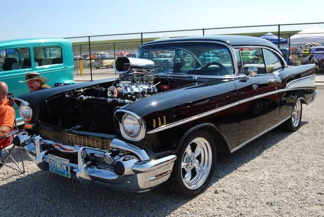
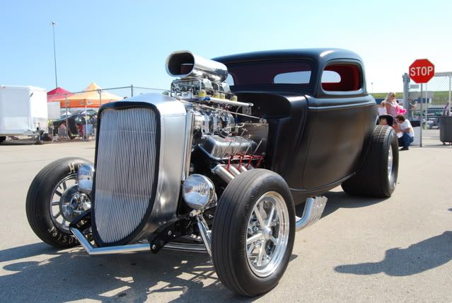
Good-Guys 7th Midwestern Nationals
What an incredible weekend at the Kansas Speedway! Thousands of hot rods with over-the-top fat tires and gargantuan blowers, hot dogs that cost more for one than an entire six-pack of my favorite beer, and of course, lots of good old fashioned Kansas sunshine.
Check out these beautiful beasts:
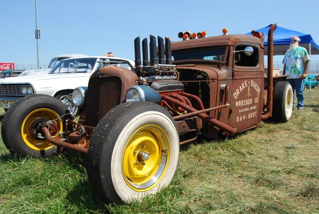
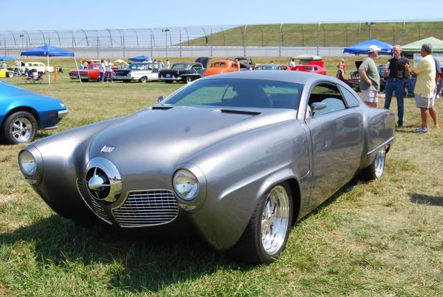
You can see all my photos of this event here. Read on...
For those of you whom I met and talked to, thanks for chewing the fat with me and helping me to learn more about these amazing machines. And if you're just stopping by this blog because of the business card I left for you, thanks for checking it out. Much obliged.
One of my most marketable skills is drawing hot rods, either in exaggerated form (like here) or in more realistic portrait styles (like here). Photos are great, but there's nothing like a custom artistic rendering of your one-of-a-kind hot rod. Tee-shirt designs and promotional posters are also in my bag of tricks.
Leave a comment here or drop me an email through the About Me widget. We'll talk. S'all good.
Check out these beautiful beasts:
You can see all my photos of this event here. Read on...
For those of you whom I met and talked to, thanks for chewing the fat with me and helping me to learn more about these amazing machines. And if you're just stopping by this blog because of the business card I left for you, thanks for checking it out. Much obliged.
One of my most marketable skills is drawing hot rods, either in exaggerated form (like here) or in more realistic portrait styles (like here). Photos are great, but there's nothing like a custom artistic rendering of your one-of-a-kind hot rod. Tee-shirt designs and promotional posters are also in my bag of tricks.
Leave a comment here or drop me an email through the About Me widget. We'll talk. S'all good.
Subscribe to:
Posts (Atom)


