
The Agile Badger Illustrations: Pen and Ink
All images are Copyrighted and cannot be downloaded or reproduced without permission of K. Curtis Shontz.
Showing posts with label Pen and Ink. Show all posts

Wednesday, August 11, 2010

Breaking the Ton.

A couple months ago, I received a call from Steve "Carpy" Carpenter. If you love motorcycles and know anything about café racing, you know who Carpy is. My problem was, when he called, I didn't—and he knew it.

Steve 'Carpy' CarpenterSteve Carpenter
For the most part, cars are my thing. And though I've been fascinated by motorcycles since I was a kid, I didn't have any chops when it came to bike banter with the big boys. He'd seen my website and was interested in working together on a tee shirt design for his upcoming interview with The Speed Channel. Rotten luck, I was booked solid for several weeks out and couldn't help him.

"Sure," I say. "I'm a bit busy right now, so I'll put you on the list."

I'll wait a minute to let that sink in.

Okay, read on ...

See, here's the deal: Carpy is one of the most talented bike builders around (he recently built a Honda CB750 café bike for Green Day), and I'm talking on the telephone with him with no better idea about his identity than if he were Mr. Joe Everybody himself. If clueless were water, I'd be flailing in the deep-end wearing concrete underbritches.

But even through my blundering, I have to say, you just can't ask for a friendlier fellow than Carpy. He called me "mate" at least two dozen times, and though my stunted development in the topic of café bike building was glaring, we chatted for fifteen minutes or more about bikes, art, and the possibility of negotiating a gig.

He didn't hire me, and I can understand why. But I've reached a fortunate point in my freelance career where from time to time I can take on special work as a personal project. (I call it fortunate because I know of many freelancers who simply can't afford to take time away from commissioned work to pursue individual projects.) So when the opportunity arises, I'm on it. And this was one of those opportunities.

Café racing is a British invention of the 1960s in which the riders started from a café—typically the Ace Club in London—and raced around the block back to the same cafe before a song on the jukebox could end. Whether they break it, crack it, or just plain "do" the ton, it all meant the same thing: café racers hitting the 100 mph mark. If you want to learn more, check out these links: The Tonup Club, The Ace Cafe and The 59 Club.
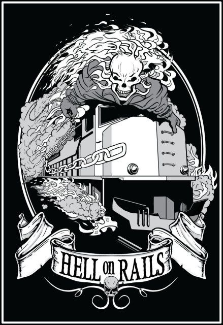
Because I didn't have any direction from a real client other than our brief conversation, this project is a bit phony; great illustration or design is always because of a great client. But if Carpy wasn't going to hire me, I was going to hire myself. I wanted to learn what might have come from the project if he had told me, "anything goes." What the heck, if I fall flat on my face, no one needs to know but me. But if I'm happy with the results, I'll offer him a signed print of the piece.

Using some photos from his web site for inspiration, and borrowing heavily from Marvel's Ghost Rider comic, here's what I came up with:

Now back to the drawing board.

Read the full post...

Thursday, February 25, 2010

Ubuntu's Karmic Koala

Ubuntu is a free, open-source operating system for personal computers. It kicks the pants off of Windows, if operating systems have pants, that is. If Windows did have pants, it doesn't anymore. Now it just stands around in its virtual underwear looking like a drunk and confused Peter Griffin from Family Guy with his paunch hanging over his joy toy. I just made that up.

Unauthorized and possibly unwanted commentary aside, the folks who publish Ubuntu User Magazine absentmindedly invited me to illustrate the Discovery Guide portion of the latest version of their software, dubbed Karmic Koala. Here are the spots I drew for them:


End of Post

Read the full post...

Wednesday, June 3, 2009

14 Jaunty Jackalopes for Ubuntu User Magazine

One of the more fun aspects of my job is the surprise - no, astonishment - that comes from the bizarre variety of subjects I'm sometimes hired to illustrate. Who'd a-thunk when I started freelance work nearly four years ago that one day I'd get paid to draw a pit bull with an Afro? Or a donkey standing in a Mexican restaurant?

And the fun just keeps on coming. I've just finished a series of spot illustrations for the first print issue of Ubuntu User Magazine. Sound normal so far? Did I mention that each one was a cartoon jackalope engaged in various computer software activities?

This one is "Burning CDs."


The theme for the Ubuntu release featured in this inaugural issue was Jaunty Jackalope. The editors asked me for twelve drawings that would illustrate several of the functions and activities featured in this free OS for home computing. They liked them enough to ask me for two more!

Here's a slideshow of all 14 illustrations.

Ubuntu Jaunty Jackalope
(click on image for slideshow)

END OF POST

Read the full post...

Friday, March 27, 2009

Lawn Care with Flair

Those good-lookin', hard-workin' boys at Fiske Brothers Yardworks in Centennial, Colorado added a new Dodge Ram pickup truck to their fleet. Co-Owner Tim Fiske asked if I would commemorate the occasion with a tee shirt design for his employees.


I never thought of myself much of a truck guy, but this was a fun gig. The Dodge Rams are really tough looking, and I love the 18-wheeler-look to their hood and grille.

I also couldn't help but put some fatties on the mower, just for fun.

Now back to the drawing board.

End of post.

Read the full post...

Wednesday, February 18, 2009

It's a Back Alley Brawl, Y'all

Here's a family feud that car fanatics have wrassled over for nearly 40 years:

Two cars from one car company, both archetypal muscle cars of the late 60's and early 70's, both designed and marketed to lure torque-starved gearheads away from hot-selling Mustangs and Camaros. These two cars are so embedded in automotive lore that arguments over the superiority of each is the subject of bar stool ballyhoo and online forum fights to this day. In a time when design sensibilities change so rapidly that it's an insult to say, "that's so 2004," the fact that this argument has survived across a generation is a testament to the timeless appeal of these classic cars.

Charger vs. Challenger. Read on...


This illustration is an expanded version of a simpler one I made for my graphic design partner Justin Kite for the promotion of the upcoming Gear Grinder car show in Kansas City, MO on April 17th and 18th. The poster version loses the background buildings to give Justin more elbow room for his design. Limited edition prints of both the promotional poster and the full illustration will be on sale at the show.

For dynamic scenes like these, my usual process would normally have started with a series of thumbnail sketches showing varying points of view, car orientations, and lighting schemes. After selecting the one that the client and I liked, I'd work up a pencil rough of the entire scene before inking, scanning, and embellishing with digital enhancements. Using this process, a scene like this would take, on average, six to eight hours to finish. That's not out of the ordinary for illustration work, but I've been working recently on updating my workflow to reduce the number of early thumbnail sketches I need to get the design layout established. It's hard to call any process that includes a scanner and Photoshop "old school," but that's pretty much what it's becoming.

I now use Google SketchUp to build rough, block models of the major components - in this case, the three cars and the buildings - and push them around the scene until I get the pose I like. The models aren't at all detailed; I'm just careful to locate the wheels at the proper wheelbase and track width, and I try to model the basic body proportions so that they match the car model and year I'll be drawing. To add a sense of motion, I can steer the wheels and roll the bodies against the direction of the turn. I can even change the shadows by varying the sun angle and time of day, all before graphite ever hits paper.

Once the scene is defined in SketchUp, I can print out a low-res .jpeg that I export from the model and use it as an underlay for the detailed sketch. For this scene, I used the same model for all three cars - the Charger, the Challenger, and the cop car in the background. Dozens of photo references of the real cars helped me make the final drawings look accurate. The SketchUp model even provided rough locations for the buildings so I could quickly overlay details like bricks, windows, exhaust hoods, and flying trash cans.

For now, I'm not saving much time in the overall process because of the front-loaded time suck involved in building the models. But once I have generic block models of a few trucks, hot rods, and muscle cars, I'll have a handy kit of parts for any new project.

Now back to the drawing board.
Read the full post...

Saturday, December 6, 2008

Game Dog Guardian Logo

After months of drawing and tweaking, and six trash-cans-full of wadded-up trace paper later, here's the logo that Killer Kite and I came up with for a new pit bull rescue operation.


Read the full post...

Monday, November 17, 2008

Wacom Rules the Planet. Resistance is Futile.

There's no doubt about it now, my Wacom pen tablet iz tha shiz, y'all. It has sped up my workflow, improved the quality of my line work, expanded my digital painting capabilities, and on more than one occasion made me giggle like a little girl just from the sheer joy of drawing.

Yes, a little girl. I'm secure, I can say it.

Here's the first work I made using this patently perfect peripheral:


If you're considering the purchase of a Wacom tablet, read on...


First, the 6x8 model is the perfect size for the work I do. If you tend to use your elbow as a pivot point when striking a long smooth arc, the next smaller version, the 4x6 model, couldn't possibly be give you enough real estate to pull it off. And the next larger sizes, the 6x11 and the 9x12, seem too bulky to hold comfortably in your lap. Unless you have a lap the size of an Astro Van. Besides, Danidraws.com recommends the 6x8, and that's good enough for me.

The tablet has a total of eight buttons. They're grouped in two clusters of four, one cluster in each upper corner. Of course, they're fully programmable. And, you can specify different functions for each button depending on what application you're running. For example, a button can execute the "b" shortcut (the Brush tool) when you're in Photoshop, and the same button can activate the "p" shortcut (the Pen tool) when you're in Illustrator.

I don't know about you, but that makes me all tingly.


In the left group, I programmed the upper-right button for the "e" shortcut (Eraser tool), and the button below it for the "b" shortcut. That way, I can toggle between the two functions with my left hand while my right hand is busy layin' down the love. (Wait, that didn't sound right, did it?)

Next to each group of buttons is a touch-strip that is also programmable, but is useful only for zooming and scrolling. If you've used a touch pad on a lap-top computer, you'll no doubt have no trouble getting used to the touch-strip.

Finally, Wacom's website also has a great list of tips and tricks for Photoshop, Corel Painter, and Adobe Flash. These guys know how to do support right.

Yes, I'm glowing. This thing is fan-frickin-tabulous.

I'm not ashamed of my feelings.

Now back to the drawing table(t).

Read the full post...

Monday, August 11, 2008

Gear Grinder Hot Rod Show

Do what the bad ass poster tells ya. If you don't go, prepare yourself for deep sadness.


Illustration by The Agile Badger; poster design by Killer Kite Productions.

Read the full post...

Thursday, July 17, 2008

Bitchin' Camaro! Bitchin' Camaro!

Here's a 1967 Camaro SS that's going into my personal stock images collection for future use. It's modeled after the Deathproof promotional poster. Duh.

Disclaimer: The title of this post in no way condones the behavior depicted in the lyrics of the song "Bitchin' Camaro" by the Dead Milkmen. I do not believe that running over old ladies is a good thing. Really. So chill out already. It's a cool song though.

Read the full post...

Monday, June 16, 2008

Software Logo

The client, Dru Sellers, wanted a logo for his new software application that manages data traffic through a very complicated system of...well, trust me, it's complicated.

To emphasize the bulletproof quality of their coding, he wanted to use an image of a bus that looked so tough, it couldn't be busted by a sledgeroller, which is his term for a steamroller made out of sledgehammers. (edit: The term "sledgeroller" actually belongs to my buddy, Jim Sowers, who is known among his peers for highly creative use of language, as evidenced by his nickname for me, "Slappy Bitch-Pants.")

Here's the logo we came up with:

Read the full post...

Thursday, May 8, 2008

Which Pit Bull would you pet?

(Loosely to the tune of the beloved Sesame Street song, "One of these things"):

One of these Pit Bulls is not like the other.
One of them's happy and the other one scowls.
Can you guess which Pit Bull is feeling much better,
Before the angry one growls?
And now the angry one's growled..."


Funny how really good clients can point out subtleties that I somehow missed. My first attempt at drawing this client's Pit Bull for a logo I'm developing with Justin Kite, turned out to look meaner and angrier than what the client wanted to express. I was going for "tough and strong," but I guess I ended up with "pissed off." And a pissed-off pit bull is not the message we want here, kiddies. So, I reworked the eyes and the mouth, and softened the sharp shadows.

Still, I don't think I'd try snagging a bone from either one's mouth.

Read the full post...

Tuesday, March 25, 2008

'67 Chevelle!


I did the '67 Chevelle Illustration. Killer Kite designed the poster.

Read the full post...

Saturday, February 2, 2008

'53 Merc vs '34 Ford

You can't stop the chop.

This is a illustration I did for a good buddy of mine who makes, among many other things, posters for Rockabilly concerts. I did the rendering in the style of Tuck, a.k.a. Jeff Tuckner, who is without a doubt one of the best hot rod illustrators around. He's way better at this than I am. He used to be at www.hollywoodtuck.com, but that link doesn't appear to be working right now. Anyone know if he's posting work anywhere on the web?


Read the full post...

Rumblefish

Here's an illustration for Restaurant Startup and Growth magazine. The article was called "A Little Fish in a Big Pond." Pretty literal, huh?

Read the full post...

What's Different About These Two Illustrations?


This is a recent illustration for Dive Center Business magazine. The top version was the first one I submitted to the A/D, and the bottom version was the one that ended up getting published. I guess the top version was too over-the-top for the readership. I think the A/D liked it, but there are always other forces to reckon with. Still, they both turned out fine. The top one will end up in my portfolio, though.

Read the full post...

Thursday, August 16, 2007

Gizbots I and II

Here are a couple of stream-of-consciousness images I made while on Summer vacation to Colorado.

This is Gizbot I, and the next one is Gizbot II: Tuning Goons


Read the full post...

Wednesday, August 15, 2007

Sugarbowl Falls

Sugarbowl Falls is a fictional town in the Midwest, and these are some of the characters who live there. It's my illustrated version of Lake Woebegon, with a little more hick influence.

Read the full post...

Tuesday, August 14, 2007

Woman of the People

A sketch of a black marble bust in our local art museum.

Read the full post...

Gaudi Dragon

A sketch of a sculpture by Antoni Gaudi, the famous Spanish architect who died a pauper after the construction of his masterpiece Sagrada Familia slowed to a halt due to a series of tragic losses in his life -- including the benefactor of the project.

Read the full post...